Welcome!

By registering with us, you'll be able to discuss, share and private message with other members of our community.

SignUp Now!

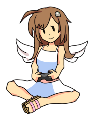
My take on a site mascot

ciro64

Member
Staff member
Joined
Aug 25, 2025
Messages
470
I know the engagement here has been a little slow, and that includes from my part since I've been taking some time to work on myself. But I do want to get back on track and I do have plans on growing this site >:3

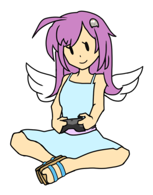
I've been planning to vectorize the mascot for a while to get rid of those white artifacts in the dark theme... but I also decided that Rhythm Girl and the logo has got to go, since I don't want any potential problems with Nintendo ninjas. So I decided to come up with a donut steel I was vectorizing it:


path9750.png

It fits the "Heaven" theme. What do you guys think?

I might do some touch ups later, since Inkscape nativelly doesn't allow for strokes of varying width (well, it does using a certain feature but it's clunky, so I'll figure that out later)
 
Ah, that kinda sucks, that the Rhythm Heaven look has to go, I kinda liked it. I know it's taking a chance unless this site becomes super huge, I don't see Nintendo going after this site. Heck even RGT still uses its' NES sprites & that place is definitely illegal lol.

Worse comes to worse maybe (like wiwi said) we can come up with a suitable replacement (with the same vibes & all) for the mascot or something. But that's only if the current one REALLY needs to go!
The theme and its background can stay, just the mascot and the logo that got me a little worried.

I know I can test how further I can go with a copyrighted representation but I like having peace on my mind :mochidistress:
Also I do feel a little better having something slighty more original too.

I won't make changes on a whim though, that's why I made this thread, to hear what your guys think about it.
 
I know the engagement here has been a little slow, and that includes from my part since I've been taking some time to work on myself. But I do want to get back on track and I do have plans on growing this site >:3

I've been planning to vectorize the mascot for a while to get rid of those white artifacts in the dark theme... but I also decided that Rhythm Girl and the logo has got to go, since I don't want any potential problems with Nintendo ninjas. So I decided to come up with a donut steel I was vectorizing it:


View attachment 4571

It fits the "Heaven" theme. What do you guys think?

I might do some touch ups later, since Inkscape nativelly doesn't allow for strokes of varying width (well, it does using a certain feature but it's clunky, so I'll figure that out later)

you can try using gimp. it allows for brush effects to be applied to stroke lines.
 
I reaaallly don't think having the Rhythm Heaven stuff is particularly dangerous. Maybe just keep something as a backup just in case.
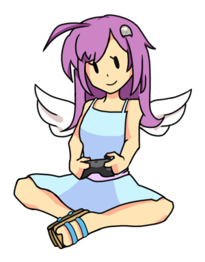
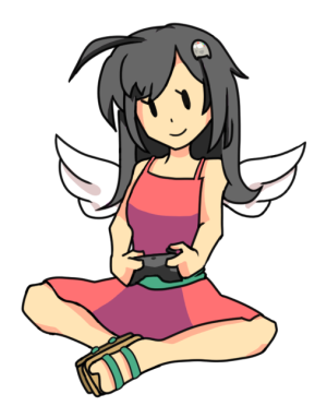
but for your peace of mind I tried my hand at something, if you have any suggestions or elements to add or change (or just clean it up), go ahead & shoot
View attachment 4593View attachment 4594View attachment 4596

View attachment 4597
Omigosh, she looks lovely! And fits the vibe of this site pretty well!

I was doing some local experiments, this is where I was at now..

1760923915282.png

I gotta shuffle those letters a bit to make a little more wacky... what do you guys think of this logo idea? (the letters in the cloud, in this case)

Anyway, I'd love to have your character design there!
 
Back
Top